Todd's Guide to Creating Video Tutorials
If you’re going to be doing any kind of educational video, one where you’re trying to explain how something works, you’re going to want to have some visuals accompany your script.
And you’re probably expecting me to start my blog post with a chat about visual design, right? But I’m not! Instead, let me talk about what I think is one of the most underrated parts of visual components for videos, and that’s…
The importance of motion
I think most of us understand the value of a good visual aid or diagram. (“A picture is worth a thousand words” and all that) But just as important is the value of motion when added to those diagrams.
For instance, displaying certain elements at just the right time is a great way for people to understand that certain steps happen in a specific sequence.
And by fading in (or fading out) certain elements while you’re talking about them, you can make sure users are focused on the relevant part of your diagram, while still understanding how it fits into the larger picture.
And there’s no better way to communicate that certain bits of data are sent from one system to another than by actually showing that data traveling across the screen.
For example, let’s check out this animation, where we show the process for creating a Link token…
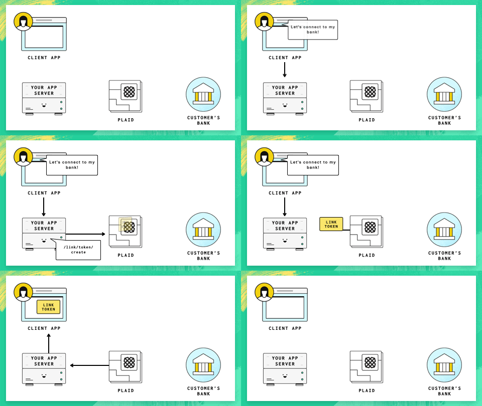
If I tried to show you all these steps at once in a static diagram, it would be a mess, and it would take you some time to figure out in what order things happen. Whereas with an animation, it’s pretty obvious the where and when the Link token is created, and how it gets back to your client.
So yes, having good-looking slides are important, but I think that if you can start to think about how your slides will look over time, that can help a lot in creating compelling visuals.
Okay, so now, let’s talk about…
Some actual advice
In no particular order, presented as a giant bullet point list!
-
Use Keynote. Or PowerPoint if you’re a Windows person. Don’t use Google Slides. Look, Google Slides is great if you’re trying to create collaborative slides with other people. And it’s good enough for live presentations. But its animation abilities are non-existent compared to what you can get from locally run programs like Keynote or PowerPoint. And like I said above, you want to be adding good animations to your presentations.
- You can also use After Effects if you’re feeling really fancy. That’s what we used for the Get to Know Cloud Firestore series, but those were made with with the help of a professional animator, and I suspect the learning curve is pretty steep.
- I know Canva is pretty popular these days for presentations, too, but I don’t know how good its animation capabilities are, so I can’t give you much of a recommendation either way.
-
Have as few words on screen as possible. It’s very difficult to read one thing while listening to another. You want your audience to quickly scan the text on screen then start paying attention to you, not reading a bunch of stuff.
- This means watch out for Death by Bullet Points if you’re creating slides. There’s nothing wrong with creating a few bullet points, but they should be 3-word summaries of what you’re saying; don’t try to paraphrase everything you’re trying to say.
- For example, if you slide looks like this:
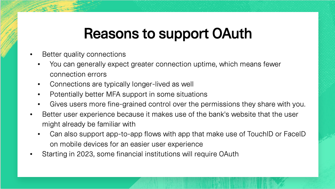
- Maybe ask yourself if you could turn it into this:
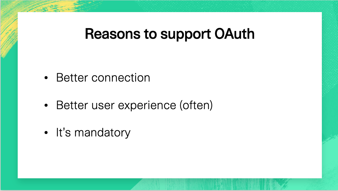
- Or maybe even this!
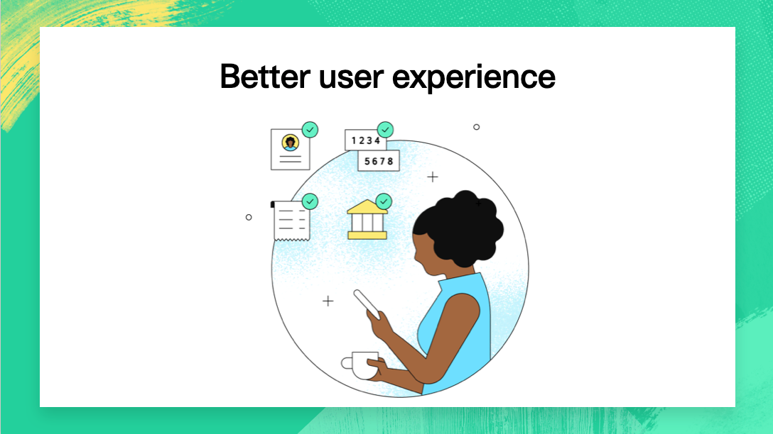
If you think you're going to spend a lot of time on each bullet point, try splitting it into multiple slides.
-
Think about establishing common conventions that your slides will adhere to over multiple presentations.
- Are the majority of your talks going to feature an auth service talking to a web server that’s
talking to a mobile device? Try to re-use the same general diagram and keep these items in the
same location every time — if your users start watching more than one video, they’ll more
intuitively understand what these diagrams are and what they mean.
- Also, it’ll make life easier for you, because you can copy and paste content from one slide deck to the next
- Similarly, keep your animation style consistent. Do you use a small black dot to convey
transmitting data from one service to another? Or a “Pop-up padlock” animation to convey that
access is prohibited? Keep that the same across all your videos.
- For example, this animation for “swapping a public token to an access token” is used across
all my videos, and I tend use this same effect in any other situation where this type of
“exchange one item for another” operation happens.
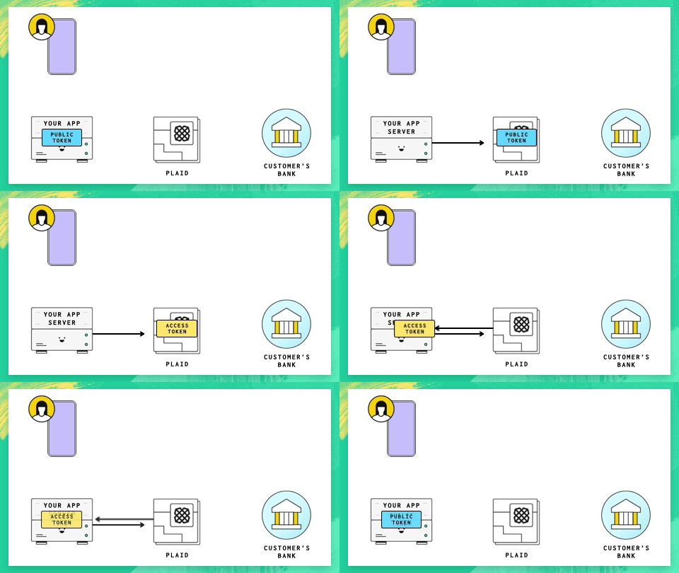
- You might have also noticed that I’m keeping the graphics for the user’s device and the customer’s bank in this slide even though they have nothing to do with this particular exchange. But again, this repetition of common elements and positions helps you to understand exactly how this operation fit into the larger system.
- For example, this animation for “swapping a public token to an access token” is used across
all my videos, and I tend use this same effect in any other situation where this type of
“exchange one item for another” operation happens.
- Are the majority of your talks going to feature an auth service talking to a web server that’s
talking to a mobile device? Try to re-use the same general diagram and keep these items in the
same location every time — if your users start watching more than one video, they’ll more
intuitively understand what these diagrams are and what they mean.
-
Start with the most complicated diagram first, where you’re going to have the most elements on screen. Once you’ve figured out your busiest diagram, it’s easier to subtract elements from there to create all of your other diagrams, and you can keep elements consistent across all of your slides.
-
Don’t go overboard with the fancy animations or “builds”! You want the animations to enhance your presentation, not distract from it.
-
I tend to use plain ol’ dissolve for about 80% of my animations when I need to make something appear or disappear. I like using the “pop” animation for speech bubbles, and “line draw” for when I want arrows to appear.
-
You should also keep these animations quick. Look at how fast animations typically are on your iPhone — unlock your screen and see how quickly those icons pop in. Click on an icon and see how quickly it opens up. Slide from page to page. Notice how zippy these all feel?
-
I usually like to have simple animations like dissolves last for about .35 seconds. Longer animations like “pops” are .75 seconds. Line Draws are somewhere in the middle, depending on the length of the line.
-
Magic Move can be a really amazing tool! If you’re trying to coordinate a lot of things moving around at once, or want to “pan” your entire graphic to one side to bring in new elements, try creating your before and after scenes on two different slides and then using Magic Move to animate between them.
-
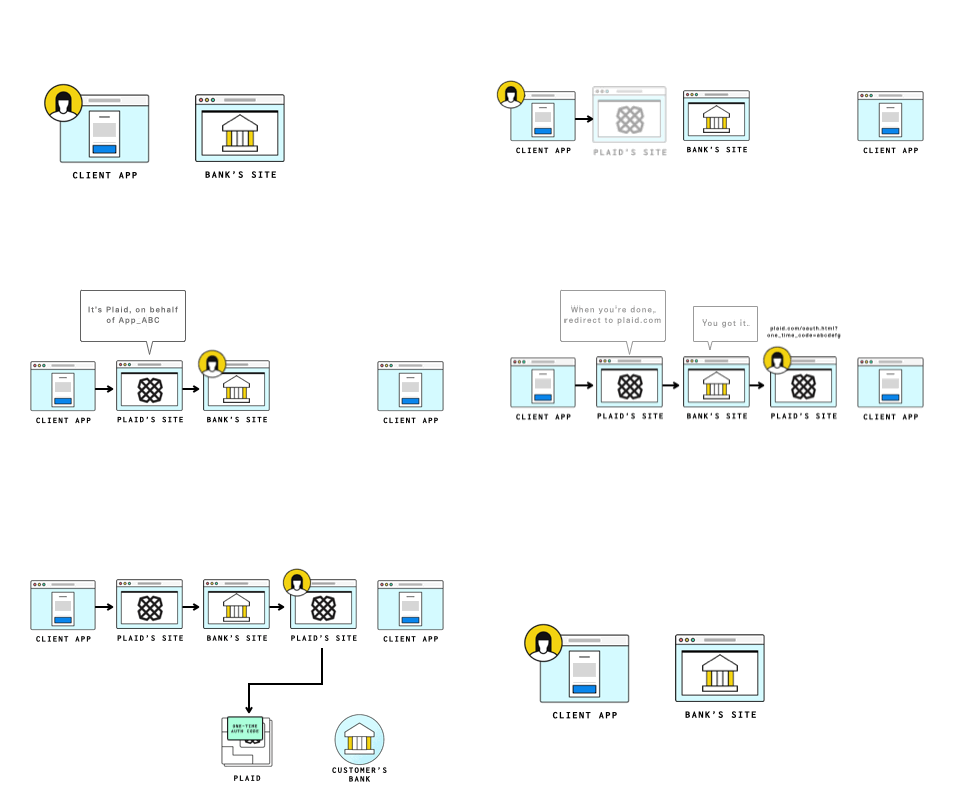
Some of these animations would have been so much harder without Magic Move
- Personally, I am a fan of “Anthropomorphic speech bubbles” as a way of communicating information. It’s kinda my trademark, but you’re free to use it. :)
Yeah, yeah, but how about some design advice?!
In terms of making good-looking slides, I actually don’t have a lot of great advice, because my visual design skills are kinda crap. Luckily, they don’t need to be that good because at Plaid, we have a design team with a bunch of very talented designers who have already done the hard work of creating a visual design style for us.
-
So if you’re working at a corporation, check in with your design team around standards. They’ll most likely have a set of fonts, colors, and other design elements that they’ll want to make sure you follow.
-
Just by following those guidelines, your slides will feel a lot more “on brand” and it’ll look like you know what you’re doing.
-
I would be cautious, though. about having your your design team create slide templates. Designers seem to be notorious for creating slide templates that look great, but are impractical to actually use.
- I’ve gotten back slide templates that use .pngs for diagram elements instead of native shapes, graphics baked into the background that are nearly impossible to change, or elements that are, like, 5 different shapes and text components all grouped together.
-
But you should definitely start building up your own slide deck full of common elements, animations, backgrounds etc. that you can cut and paste from when you need it. Again, that makes it a lot easier for you to get work done, and you can share it with other team members to make sure your videos look consistent. (Assuming that’s the look you’re going for.)
-
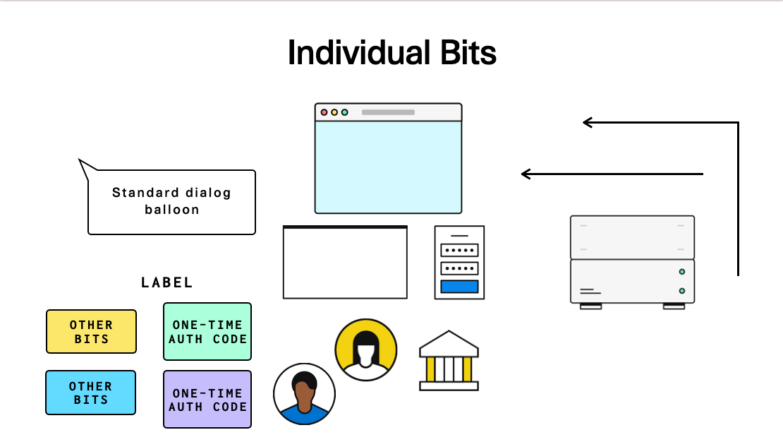
One slide from my 'master deck of graphics and animations that I might need later'
-
If you’re interested in reading a pretty good book on the topic, I recommend Presentation Zen by Garr Reynolds — it’s more about delivering live presentations instead of videos (and, hey, whadayaknow, there’s a whole chapter on “crafting a story”), but a lot of the lessons are still relevant.
-
Speaking of, if you’re looking for a decent introduction to design, I really liked the Non Designers Design Book by Robin Williams (no, not that Robin Williams) — this is more a general book about design than about videos or presentations, but a lot of the sample principles still apply.
- She also has a Non Designers Presentation Book, but I haven’t read it, so I can’t vouch for it. But I’m sure it’s pretty good!
So, what’s my process like?
I usually do a “Super-duper ugly rough pass” of my slides when I’m first writing the script, so I have something to cut-and-paste into the right-hand column of the document.
Once the script is done and off for review (and I get a sense there aren’t major changes coming), I’ll take some time to put together a more complete version of my slides. It’s at this point I’ll work on adding the animations, figuring out transitions, and adding the bits that I hand-waved until later.
Usually at this point, I’ll realize there are a few graphics that I need that aren’t available, or have just really ugly placeholders. That’s when I reach out to my friendly neighborhood design contact!
When do I get an artist involved?
When my slides are in a “Nearly done except that I have one or two placeholder graphics” state, that’s when I’ll reach out to somebody on the design team and ask them to do a little ad-hoc design work. But your process will depend quite a bit on what kind of in-house art resources you have available, and how they like to work.
When I first started out at Plaid, and didn’t have a good repertoire yet of graphics, I regularly worked with an in-house designer. Typically I’d send her my slides (with a few comments pointing out what placeholder graphics needed to be adjusted) and in her spare time between other projects, she’d clean them up for me; rearranging the layout in places, adjusting font spacing, and adding graphics if I needed them.
That designer left the company after a year, but at that point I was more comfortable with our style * I also had lots of previous artwork I could copy-and-paste-and-adjust as needed . So these days I’m able to muddle through most of this on my own. But I still reach out to the design folks when I need a little extra help.
The biggest issue I’ve found is that it’s difficult for me to plan out in advance when I’m going to need any design help. So while the work itself is never too onerous, my requests still take the form of, “Hey! Can you drop whatever you’re doing to work on my project that I didn’t give you any heads-up about? Kthxbai.” I’m sure they hate this, but I haven’t figured out anything better at this point.
It usually takes my designer about a week to turn around these slide improvements (like I said, it’s only a day of actual work, they need time to schedule it in). But I have plenty of other things to work on in the meantime.
Finding good art resources
Don’t have the time, budget, or resources to build all of your artwork in-house? Never fear! There’s a ton of good resources out there where you can get pretty good stock photos, illustrations, or animations to go along with your video.
Unsplash is a popular place for free photos, Envato Elements has a really nice subscription service for individual creators * Sadly, their pricing structure was such that I couldn't afford them because I work at a larger company. , Pixabay is a good place to find free content, and iStockPhoto is a great overall resource, too. Jeff Delaney (of Fireship.io fame) uses VideoHive.net (which looks like it entered some kind of partnership with Envato), and at Plaid I mostly make use of good ol’ Adobe Stock.
A lot of these places have subscription services, which can save you money if you’re going to be using a lot of their content, but I use them infrequently enough that I generally just buy them as needed.
That said, if you decide to go the third party route, make sure these graphics fit the overall style that you or your company is trying to convey. If your design style is heavy Corporate Memphis, then you decide to throw some stock photographs into the mix, it’ll look weird.
But even more subtly, watch out for things like downloading images that have a lot of shading, if your images tend to be flat. Or downloading images where people are represented differently than the way your company typically does them.
So if you have the option (and a copy of Creative Cloud), I’d recommend downloading the Illustrator version of any stock art you purchase. I’ve found that, even with my crappy Adobe Illustrator skills, I’m able to do just enough to tweak a piece of vector graphic that a casual observer would think it’s part of our graphic repertoire * It doesn't fool our designers, tho. They notice right away. .
Anyway, once you’ve made (or purchased) your art, have put together a good first pass of your slides, and given them to your local artist to clean up, it’s time for our next step… doing the screen recording!
Part 6: Time to record your screen